Ready to learn Big Data Analytics? Browse courses like Big Data – What Every Manager Needs to Know developed by industry thought leaders and Experfy in Harvard Innovation Lab.
Many of you have likely experienced the same situation that I have encountered where you have received a report and thought “what am I looking at?”, “whats the point?”. The pack is full of tables and it’s difficult to see the wood for the trees! How can you, as the data expert, show your business partners that you have a clear and comprehensive understanding of their business, without burying them in data?
Conveying information and being able to tell ‘data stories’ is a skill which shouldn’t be over-looked for any data expert. Often in business, your perceived competency is as important as your actual ability. An ability to demonstrate your skills to a non-technical audience is critical if you want to advance your career. Providing clear and easily consumable reports will also mean your recommendations are more likely to be considered! If you are in an advice/business intelligence role, you need to quickly show the ‘burning platform’ or the reason a change is required otherwise stakeholders will be less likely to take any action. This is how you make yourself valuable and ultimately indispensable to your business partners.
To highlight the problem I prepared a small data-set comprised of the sales and revenue performance for a fictional business. Sales Volume, Head Count, Operating Costs and Revenue are included for a 12 week period for four different offices. The assumptions made are that this business has four offices that perform the same task and operate independently. The operating costs are purely staff salaries. The purpose of the report is for the leaders of each office to come together with the head of this company to measure and compare their performance.
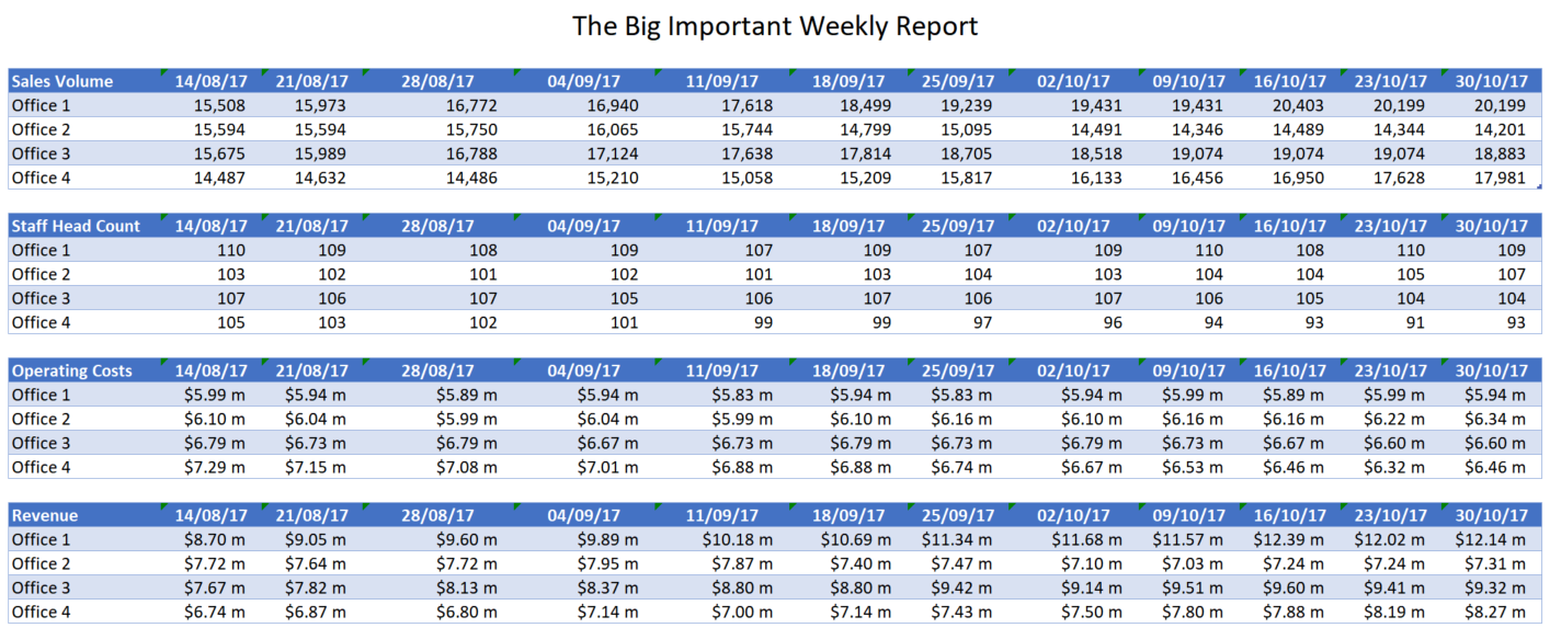
Example of a typical data report for a business stakeholder.
As you can see, the sample data set is typical of many reports distributed across any large organisation. It has the information requested from the business and doesn’t contain any data errors. So apart from being mathematically valid, is it a good report? What am I expecting the senior leaders of this business to do with it? The numbers all seem OK?
Although there is nothing ‘wrong’ with this report, there is a lot of opportunity for improvement. Senior leaders are famously time poor and focused on the big picture. For these reasons, we want to show them the key points quickly and clearly with as little distraction as possible.
Some challenges from a management perspective are data points like ‘Revenue’. This metric (in the example) is made up of the number of sales and the amount of revenue from each sale. As it is effectively the total of two smaller metrics, taking an action to improve Revenue is a challenge? Should I focus on increasing sales or increasing margin? Similarly operating cost, as mentioned, this is purely comprised of staff salaries. Should I focus on having less staff or should I pay them less? We do have Head Count in the report however the manager would need to calculate average wages themselves to answer the question which is not an optimal outcome.
How COULD this report be presented?
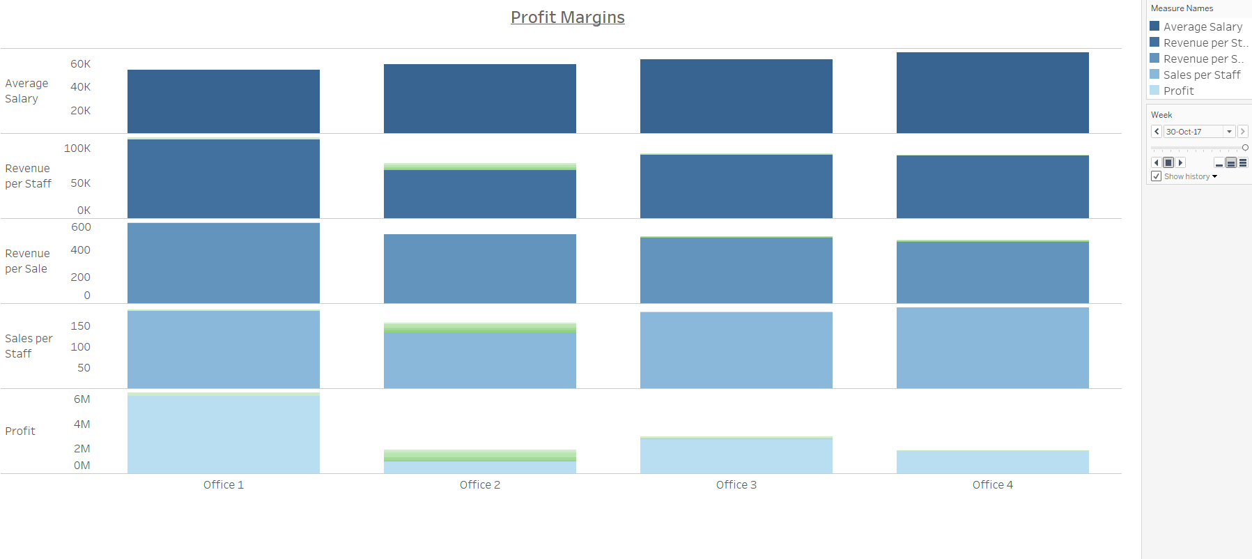
Visual alternative to the original report.
The original report could be presented visually, the example above was prepared using Tableau which is an incredibly efficient tool requiring limited training to get started. LinkedIn learning has some free courses available herehowever there are many many free and affordable courses online.
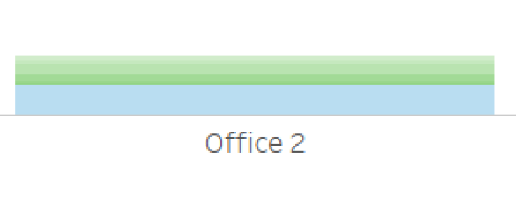
The graph shows the results for the final week in the original data however displaying an aggregate of the 12 weeks could be presented in the same format. Alternatively we could use line graphs to show the results over time if the business is more focused on the change over time rather than point in time performance. The blue regions represent the current information, with the green highlighting the previous weeks results. The darker the green shading, the more recent the region represents. This is just an example of how recent performance can be included in a single visual however for ‘Office 2’, we can see Profit has dropped repeatedly in recent weeks.
The senior leaders are likely going to be focused on Profit as their overall goal. They will likely have some additional quality and customer satisfaction metrics however lets consider those out of the scope of our project. The data has been recalculated to show metrics like ‘Average Salary’, ‘Revenue per Staff’, ‘Revenue per Sale’, ‘Sales per Staff’, and finally ‘Profit’. The order of these has been provided so Profit is last as the metrics above will aggregate to impact the total Profit. Each office has their own column and we can quickly and effectively compare the performance of each site.
So what can we take away from this new report? The original tables didn’t raise any alarms for me, however, the new report has highlighted:
- Significant differences in average salaries between the four sites
- Inconsistent Revenue per Staff and Revenue per Sale figures
- Office 1 significantly more profitable than all other offices.
There are many ways to show this information and there are there will be advantages and disadvantages to each. Some of the considerations I made when preparing the visual were:
Declutter: Exclue unnecessary data points, gridlines, axis values etc.
Colour scheme: All columns are a different shade of blue which keeps them connected (one company) but allows the reader to differentiate the rows. The colours are also softer (more grey) so they are less intense and easier to focus on for longer periods.
Profit Last: As the metrics above all contribute to profit, this appears at the bottom as a ‘summary’ metric.
As I mentioned, there are many ways to show this report and there are aspects of this visual that I like and dislike however rarely will a visual be completely perfect. Try and find the compromise which best suits the purpose of your report however I hope this short article has stimulated your thinking on the topic!
Originally posted at Towards Data Science