Ready to learn Data Science? Browse courses like Effective Data Visualization developed by industry thought leaders and Experfy in Harvard Innovation Lab.
The Pioneers of Data Visualization
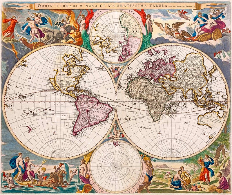
Nicolaes Visscher, Orbis Terrarum Nova et Accuratissima Tabula, 1658
Looking back at Humanity’s history, we can observe multiple situations where individuals found ways to visually describe and document their experiences. Cave paintings depict battle scenes between man and beast, Egyptian murals give us a glimpse of the lifestyle and reverence towards Pharaohs, the royal family and other deities; as well as the struggles and hardship of peasant life. Fast forward a few centuries and painters, sculptors and other artists across the globe were imprinting their view of the world through their art.
We have a innate need to describe and interpret the world around us
In domains like Science and Engineering, documenting your experiments is crucial. Scientists too relied on notes, drawings, annotations and later on pictures — virtually any kind of record — to support their hypotheses and advance the collective knowledge of the scientific community.
There are other situations where instead, we want to tell a story that conveys a much more complex narrative than simply a report on results.
In this article I want to share and celebrate the work of the Pioneers of Data Visualization, the people who paved the way to in Infographs and data visualization techniques that are so popular and widespread today.
Charles Joseph Minard
Minard was a French civil engineer who worked in multiple construction projects across Europe. He had a keen eye for representing data, specially in cartography.
His prime example of visual storytelling — his most famous “infographic” — depicts Napoleon’s attempt to invade Russia in 1812. Minard combines multiple types of data in a single representation: a map is in the backdrop, but also, at the bottom, the temperature registered in each region; the size of Napoleon’s army represented by the width of the beige zone towards Moscow and in black their return. Latitude and longitude is also added for reference.
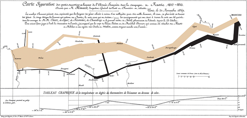
Napoleon’s Invasion of Russia (1812)
What’s most impressive in Minard’s visualization is his ability to represent many complex data points and data types in such a way that the narrative — the harduous journey from to Russia and back — is preserved as the focal point of the image.
Your eyes jump straight to the beige area, it makes you curious, such that you start looking for the story behind it. That’s when you look at other markers like the names of the cities they passed through, the numbers annotated on the sides that gradually shrink, or the fact that there’s a very thin black line representing the return of a beaten, technically defeated army.
Florence Nightingale
Born during the Victorian era in the heart of London, Florence Nightingale is the “mother” of the modern nursing practice. She was also the inspiration for the Nightingale Pledge, a adpation of the Hippocratic Oath, to which nurses abide.
Compounding to her contributions to the edification of the nursing practice, her interest in statistics lead her to develop the polar area diagram.
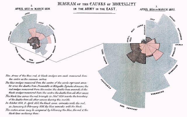
Diagram of the causes of mortality in the army in the East (1854–1855)
Nightingale’s use case for data visualization was the representation of the causes of death in the military hospital she worked at. Having collected data for approximately two years, she was able to depict deaths caused by preventable diseases (blue), as results of wounds (red) and other, unknown, causes (black).
John Snow
(Not that one!)
Snow was a British physician and one of the founders of the Epidemiological Society of London.
During the early 1800’s London experienced several cholera outbreaks that devastated the city.
One of these outbreaks — in 1854 — was closely observed by Dr. John Snow. At the time, there was a general belief that this type of disease was spread due to pollution and “bad air” — the miasma theory. In order to better understand it’s source and how the disease was transmitted among Londoners, Snow started by mapping the affected homes.
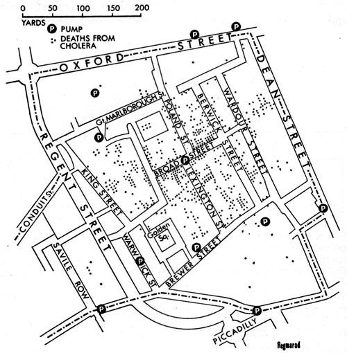
Original depiction of the London cholera epidemic of 1854
Dr. Snow was particularly intrigued by the fact that none of the workers at the local brewery manifested the disease, while virtually every other family was affected. Through multiple local inquiries, he came to the conclusion that the source of the epidemic was the poor quality of the water. Turned out the brewery workers were drinking more beer than water.
Looking at the location of the water pumps in his map, we can see a greater incidence of deaths in their vicinity, compared to neighbourhoods that are not served by them.
The suggestion to remove the handle, and thus deactivate, the water pump at the epicentre of the outbreak — Broad Street — lead to a containment of the outbreak and a gradual stagnation of the overall death toll.
It’s remarkable how the work of these pioneers and their contemporaries paved the way for disciplines that we today know as data and information visualization, as well as, the widespread use of infographics.