Researchers agree that vision is our dominant sense: 80–85% of information we perceive, learn or process is mediated through vision. It is even more so when we are trying to understand and interpret data or when we are looking for relationships among hundreds or thousands of variables to determine their relative importance. One of the most effective ways to discern important relationships is through advanced analysis and easy-to-understand visualizations.

Data visualization is applied in practically every field of knowledge. Scientists in various disciplines use computer techniques to model complex events and visualize phenomena that cannot be observed directly, such as weather patterns, medical conditions or mathematical relationships.
Data visualization provides an important suite of tools and techniques for gaining a qualitative understanding. The basic techniques are the following plots:
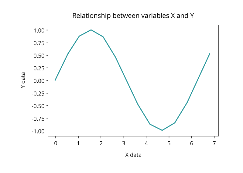
Line Plot
The simplest technique, a line plot is used to plot the relationship or dependence of one variable on another. To plot the relationship between the two variables, we can simply call the plot function.
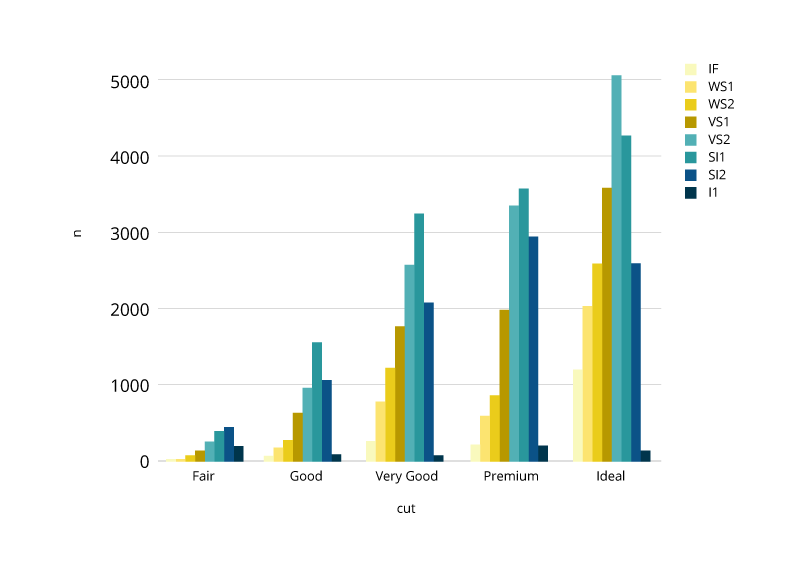
Bar Chart
Bar charts are used for comparing the quantities of different categories or groups. Values of a category are represented with the help of bars and they can be configured with vertical or horizontal bars, with the length or height of each bar representing the value.
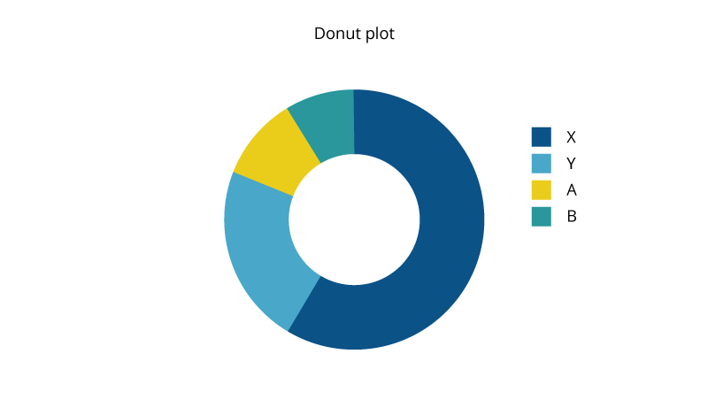
Pie and Donut Charts
There is much debate around the value of pie and donut charts. As a rule, they are used to compare the parts of a whole and are most effective when there are limited components and when text and percentages are included to describe the content. However, they can be difficult to interpret because the human eye has a hard time estimating areas and comparing visual angles.
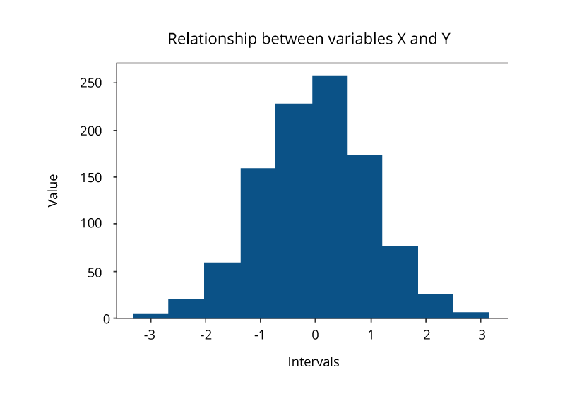
Histogram Plot
A histogram, representing the distribution of a continuous variable over a given interval or period of time, is one of the most frequently used data visualization techniques in machine learning. It plots the data by chunking it into intervals called ‘bins’. It is used to inspect the underlying frequency distribution, outliers, skewness, and so on.
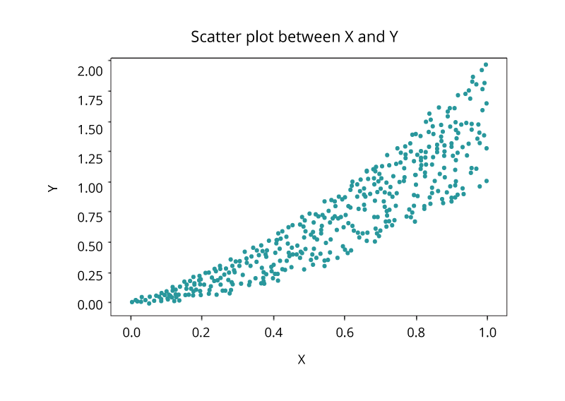
Scatter Plot
Another common visualization techniques is a scatter plot that is a two-dimensional plot representing the joint variation of two data items. Each marker (symbols such as dots, squares and plus signs) represents an observation. The marker position indicates the value for each observation. When you assign more than two measures, a scatter plot matrix is produced that is a series of scatter plots displaying every possible pairing of the measures that are assigned to the visualization. Scatter plots are used for examining the relationship, or correlations, between X and Y variables.
Visualizing Big Data
Today, organizations generate and collect data each minute. The huge amount of generated data, known as Big Data, brings new challenges to visualization because of the speed, size and diversity of information that must be taken into account. The volume, variety and velocity of such data requires from an organization to leave its comfort zone technologically to derive intelligence for effective decisions. New and more sophisticated visualization techniques based on core fundamentals of data analysis take into account not only the cardinality, but also the structure and the origin of such data.
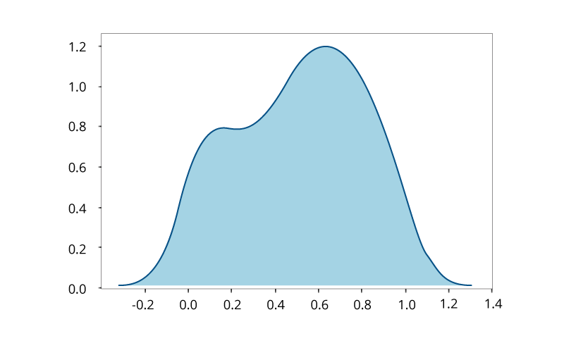
Kernel Density Estimation for Non-Parametric Data
If we have no knowledge about the population and the underlying distribution of data, such data is called non-parametric and is best visualized with the help of Kernel Density Function that represents the probability distribution function of a random variable. It is used when the parametric distribution of the data doesn’t make much sense, and you want to avoid making assumptions about the data.
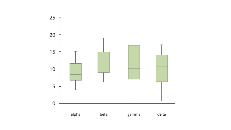
Box and Whisker Plot for Large Data
A binned box plot with whiskers shows the distribution of large data and easily see outliers. In its essence, it is a graphical display of five statistics (the minimum, lower quartile, median, upper quartile and maximum) that summarizes the distribution of a set of data. The lower quartile (25th percentile) is represented by the lower edge of the box, and the upper quartile (75th percentile) is represented by the upper edge of the box. The median (50th percentile) is represented by a central line that divides the box into sections. Extreme values are represented by whiskers that extend out from the edges of the box. Box plots are often used to understand the outliers in the data.
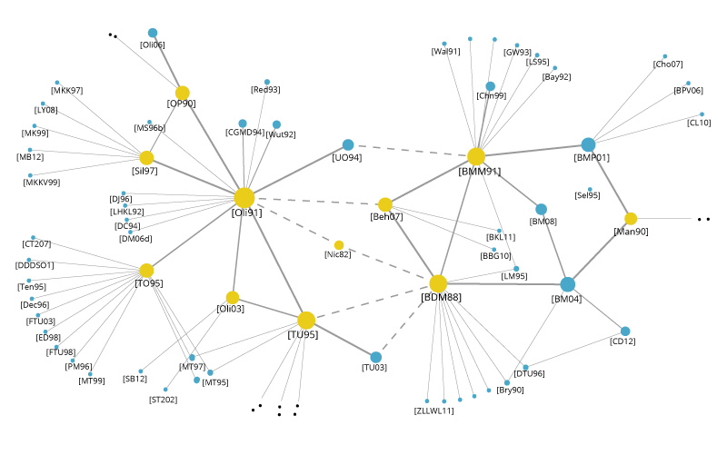
Word Clouds and Network Diagrams for Unstructured Data
The variety of big data brings challenges because semistructured and unstructured data require new visualization techniques. A word cloud visual represents the frequency of a word within a body of text with its relative size in the cloud. This technique is used on unstructured data as a way to display high- or low-frequency words.

Another visualization technique that can be used for semistructured or unstructured data is the network diagram. Network diagrams represent relationships as nodes (individual actors within the network) and ties (relationships between the individuals). They are used in many applications, for example for analysis of social networks or mapping product sales across geographic areas.
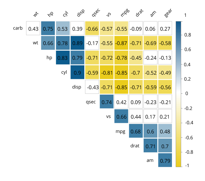
Correlation Matrices
A correlation matrix allows quick identification of relationships between variables by combining big data and fast response times. Basically, a correlation matrix is a table showing correlation coefficients between variables: Each cell in the table represents the relationship between two variables. Correlation matrices are used as a way to summarize data, as an input into a more advanced analysis, and as a diagnostic for advanced analyses.
Data visualization may become a valuable addition to any presentation and the quickest path to understanding your data. Besides, the process of visualizing data can be both enjoyable and challenging. However, with the many techniques available, it is easy to end up presenting the information using a wrong tool. To choose the most appropriate visualization technique you need to understand the data, its type and composition, what information you are trying to convey to your audience, and how viewers process visual information. Sometimes, a simple line plot can do the task saving time and effort spent on trying to plot the data using advanced Big Data techniques. Understand your data — and it will open its hidden values to you.