A step-by-step explained example available on Git and Heroku
Introduction
In this article, I am going through the steps I followed to create an interactive dashboard, using PlotlyDash, a library for Python and R, and enhancing the layout with CSS Bootstrap.
Dash library is written on top of Flask, Plotly.js, and React.js, that allows to build data visualization apps in pure Python, rendered via the web browser.
The final result I produced can be displayed here: https://corporate-dash.herokuapp.com/
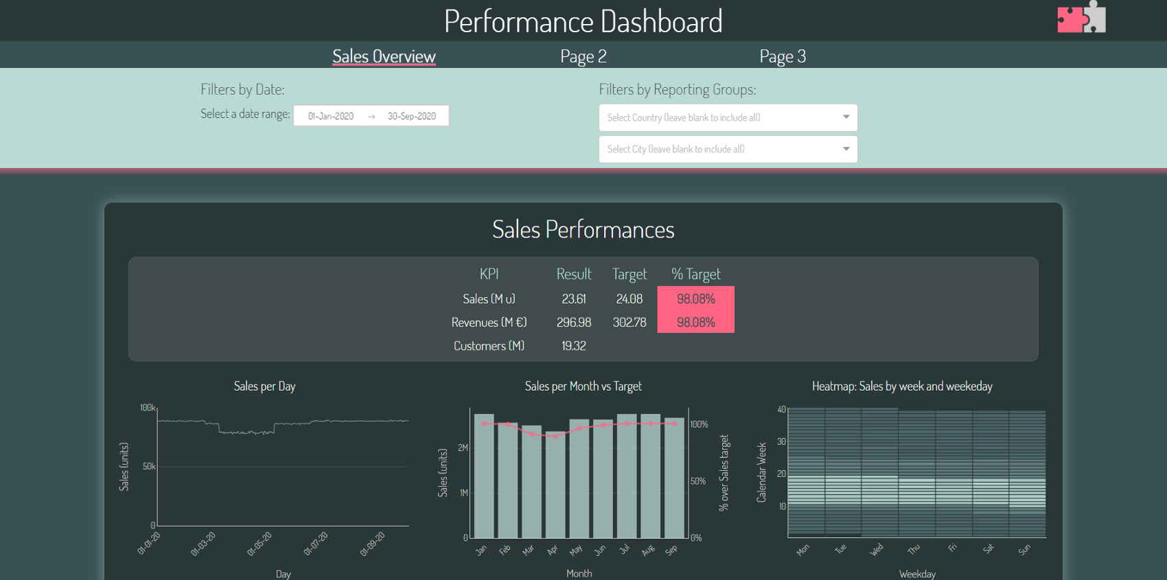
This is a multi-page dashboard, simulating a business scenario, where there normally are some layout guidelines to be respected (corporate colours scheme, a pre-defined font, a corporate website that can inspire us, …) and some sales-related KPIs to be monitored.
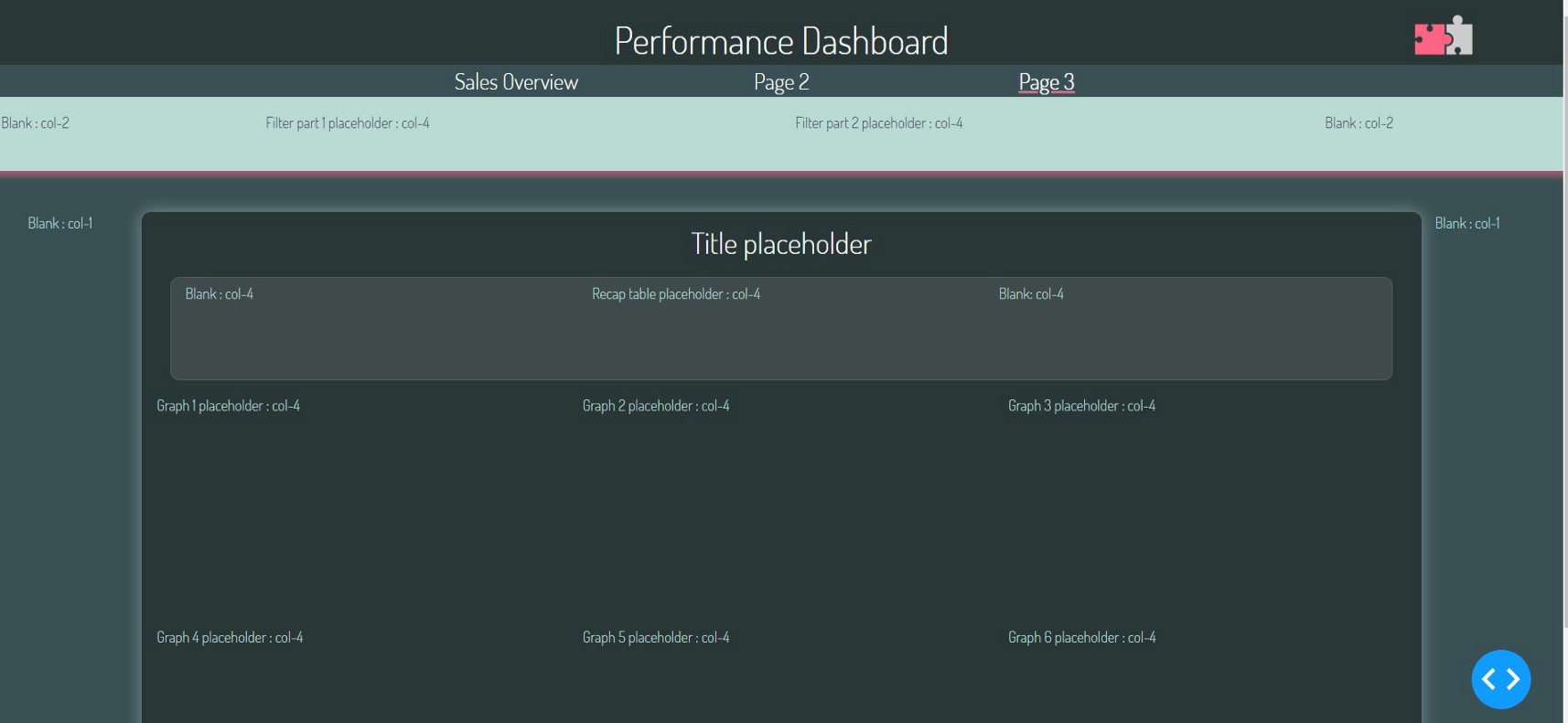
The first page is filled with different types of charts (scatter plots, bar charts, bubble charts, heat-maps) and a recap table, with random data; the other pages are blank, but useful to show how to build a multi-page structure.
In this article, I’ll cover:
3. Configuring the folder structure for a multi-page dashboard
4. Conceptualizing the layout with the CSS Bootstrap Grid system
4.1 Building the layout framework with CSS Bootstrap
4.2 Styling Dash components accessing to their CSS classes
5.1 Multi dropdown filter : how to have a “Select All” option
5.2 Unveiling seasonality patterns with Heatmaps
5.3 Providing additional information when hovering on data points
6. How to deploy and share the dashboard
1. Dashboard Objectives
Dashboards are intended to provide a clear and accurate view on some business-relevant KPIs, enabling the end user to understand what’s presented, find the information needed, apply some filters, and hopefully derive some conclusions.
This dashboard is designed like a website, composed by different pages with a top navigator bar.
Each page content is divided into three parts:
- Some top filters that can be applied to all the charts displayed in the page
- A recap table, also displayed at the top, which enables the user to quickly have a glance on the main KPIs. Ideally, the intention is for the user to avoid going through each and every chart on the page, but immediately spot where to focus on just by looking at the recap table. This recap table has some conditional colour formatting, as a sort of traffic light, highlighting the positive / negative values.
- Finally, a grid of charts, showing different views on the main KPIs
I have deliberately avoided to offer any way for the user to export the underlying data: due to the raising concerns around data privacy and data loss, the dashboard is intended to use aggregated data only. Raw data points are unreachable to the end user.
2. Getting started with Dash
There are plenty of user guidelines and introductions to plotly Dash.
I’ve personally found very useful to go through these sources, which explains plenty of examples:
- The official Dash website https://dash.plotly.com/ is very useful, easy to read and navigate, showing all available components and their main properties
- This article explains a very complete and detailed example inside-out: https://towardsdatascience.com/how-to-build-a-complex-reporting-dashboard-using-dash-and-plotl-4f4257c18a7f
- I’ve also looked for a large amount of Youtube videos that shows how to create and customise basic Dash layouts and callbacks
Despite going through all these useful sources, I’ve had to face many challenges, especially in order to understand how to customise Dash components the way I wanted.
For this reason, I will also focus on this aspect in the steps below: the enhanced features and the layout, the visual identify of the end result is a very important aspect that can make the difference.
3. Configuring the folder structure for a multi-page dashboard
The app source-code files should be structured as recommended by the Dash guidelines (https://dash.plotly.com/urls) to enable a multi-page navigation. Based on this guide, I’ve used the following approach to minimise any code change or adaptation.
My root folder contains:
- app.py : this file is very basic and will only define the app variable needed by Flask. I’ve simply followed the Plotly Dash guidelines to create this file.
- index.py : this is a sort of navigator file, helping the app managing the URLs of the different pages. Also this file is very standard: I recommend to follow the Plotly Dash guidelines for it, as we just need to customise the pathnames to have this working.
- layouts.py : all pages html layouts will be stored in this file. Given that some components (like the header or the navbar) have to be replicated on each page, I’ve created some functions to return them, avoiding many repetitions within the code
- callbacks.py : all callbacks (the functions behind the Dash components, that define the user interactions with the graphs) will be stored in this file
Within the root folder, Dash will look for:
- a “data” subfolder: containing the underlying data of the dashboard
- an “assets” subfolder: containing additional files, like: images; favorite icon, used by the browser; .css files
If this structure is followed for the assets subfolder, the app will automatically detect and use the favico.ico file or the .css files, with no code needed! Just name an image like “favicon.ico” and place it within root/assets and Dash will automatically use it.
There are some additional files within the root folder (such as the .gitgnore, README.md, Procfile, requirements.txt) : these files are needed to deploy the app on Heroku or store the code on Git Hub.
4. Conceptualizing the layout with the CSS Bootstrap Grid system
With the app folder structure in place, the next thing to configure is the overall layout of our pages. We can’t talk about a web application layout without mentioning .css files, which centralise almost all layout properties and that can be read by the browser.
In very few words, .css files define the properties (fonts properties, sizes, colors, backgounds, …) of html components, also used by Dash.
The App will start applying the layout properties to the corresponding html components, reading them from the .css files stored in the “assets” folder of the app.
It is important to note that: if the properties for the same html component (eg. a H2 html title font family) is defined in multiple .css files, the last one read by the app will be applied (let’s ignore the !important css suffix for now).
CSS properties can also be defined by creating some custom “class”, then assigned to the html components (like a div) we want to style.
In my example, I’ve used 3 .css files, which I’ve named with some leading numbers to ensure that they are read by the app in a specific order:
- A customised font, defining a new font family used by the app (you can download font families from google, copying their .css content. Note that, within the font file, there are some URLs, that the app will download. If your app will run in an offline environment, you should download the content of these URLs and place them in a subfolder: root/assets/fonts, adapting the url to this pathname, within the font .css file)
- The bootstrap .css standard file, which I’ll describe just below (I basically downloaded the official CSS file from the Bootstrap website)
- A “corporate-style.css” containing all customisation I introduced on the layout
I’ve seen that many Plotly Dash examples use a basic .css template (https://codepen.io/chriddyp/pen/bWLwgP.css): this is not a requirement for the app and I chose not to use it for my dashboard (I’ve used the official .css Bootstrap file, instead).
4.1 Building the layout framework with CSS Bootstrap
CSS Boostrap provides a lot of predefined .css properties, classes and layout features we can reuse. CSS Bootstrap is famous for the known “grid systems” which helps to scale websites pages depending on the device sizes used.
In short, we can think of our webpage as a table of rows and up to 12-columns: our html components can be placed inside this grid, which will have a dynamic size, according to the screen of the device it is displayed on.
I think this helped me a lot to obtain the layout I had in mind, which looked like the following:
I’ve started thinking about the layout from the different sections (the “rows” of my page), and then picturing in my mind the different columns of the dashboard.
I’ve assumed that, like in a business scenario, some colours are already part of the corporate visual identity (in this case a sort of green palette with some pink elements) and I’ve picked a nice font-family called Dosis.
After that, I’ve been creating the scheme in the picture, with the different placeholders and the columns Bootstrap .css classes I’ve used.
Within the CSS Bootstrap grid system, different .div elements are nested, each with its class, starting from a row and then one or more columns. CSS Bootstrap has different columns classes, from col-1 to col-12, meaning that we can have the dynamic column width we wish, starting from a column which will be a 1/12 of the max width, till a column which will use the full width available (12/12). Within each column, it is possible to nest another row-columns sequence of .Div.
All these classes can be assigned to the html.Div([]) elements, within their className property.
This system helps to keep each section of the dashboard in order, with a designated area for each Dash component that is also dynamic to the screen used.
For instance, the following structure has been used to style the header, the navbar and the filters.
The header, consists of:
- An external html.Div component, which has a .css “row” class, styled with a background color
- Three html.Div components, inside the row; each represents a “col” .css class (remember that the total of these columns width must be equal to 12): a className=”2-col” div (a column of width 2/12), which will be kept empty, just to ensure that the title is centred; a 8-col div, hosting the main page title, and finally another 2-col div, hosting the corporate logo image
Image by author
The navbar, consists of:
- Two empty col-3 div at the sides of the row
- Three central col-2 div, each will contain a dcc.Link Dash component, that can be used to switch from one page to the other. The dcc.Link page for the current page is styled differently, to highlight the page the user is on
Image by author
The filters section consists of the following components:
Externally, we have a row and column div:
- An external html.Div that has a “row sticky-top” class. This is a Bootstrap class that is the same as a row but that sticks at the top of the page, even when the user scroll down.
- Inside the row, there’s a 12-col Div with some styling properties
Within the 12-col Div column, we have another “row” div containing the following set of columns:
- Two empty col-2 div at the sides of the internal row
- Two col-4 div, internally, each containing filter components: a dcc.DatePickerRange and two dcc.Dropdown componentes
Image by author
4.2 Styling Dash components accessing to their CSS classes
Once the layout is defined, the next challenge, from a user-interface perspective, is to properly style each Dash component, such as date ranges (dcc.DatePickerRange), dropdown filters(dcc.Dropdown), etc.
All of these components have a “style” property, where we can define the css properties we want to style, such as font-size, colour, white-space, and many more. Most of the layout enhancements we want to achieve, can be achieved defining the right css property, within the “style” of the Dash component. However, I faced different challenges in styling some features of these components, which seems inaccessible from their “style” properties. I’ve read similar challenges online from many different users, wondering how to style certain feature or detail of these components.
I think the main challenge here is to identify what’s the right CSS property that is used by Dash. There’s in fact a method to point and click, or “inspect” each element on the page, and unveil the CSS property it is defined by.
We can in-fact run the app in the browser, right-click on the page and choose “Inspect”: this will pop-up a window, on the right-side of the page, where we can navigate through the html and css code of the page. At the top of the page, we can click on this tool

Image by author
We can finally hover on the element we want to style and get all its CSS classes and properties to understand what to change / redefine.
4.2.1 Examples: style a DatePickerRange element
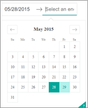
A DatePickerRange by default look like this:
We can change the component layout from the “style” property and define the font-size, add a border with some colour, etc. But how to modify that arrow that separates the start date from the end date ? How to change the green colours highlighting the selected days or around the helper icon?
These elements seem unreachable from the “style” property and we have to use a different method to change their layout properties. Within the browser, if we inspect and select the arrow, we’ll see something like that:
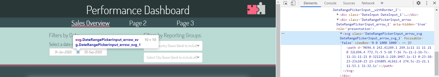
This component is using some CSS classes, that we can modify by adding some code into our custom CSS file, forcing the arrow to a new size:
Image by author
Similarly, we can unveil how the change the calendar style by inspecting the calendar selection:
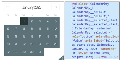
By analysing this element, it seems that “.CalendarDay__selected” is the CSS class for the date extremes that are selected, while “.CalendarDay__selected_span” is the CSS class used for all the days in between the two extremes. It is possible to use these classes to change the background colours of the calendar (and to define some layout modifications when hovering the mouse on the different days). I’ve added the code below to the custom CSS file:
Image by author
(“!important” overrides any other layout definition for the same CSS element or class).
4.2.2 Example: style a dash_table.DataTable element
Another element which I found difficult to style was the DataTable that I used in the recap section at the top of the dashboard.
DataTables have, by default, a feature that enables to select a cell, making it appear in a pink/red background colour. Additionally, by using the default CSS Bootstrap file, a default setting will change the background colour to white for all the table rows we hover on.
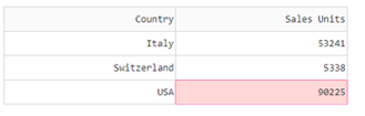
I wanted to really change these two default properties which were clashing with my overall layout.
First of all, the selectable cell is not actually a CSS property but a component property which can be disabled: adding “cell_selectable = False” within the creation of the DataTable removes this functionality.
In order to change the row hovering colour, with the method explained before we can see that DataTable rows are actually <tr> </tr> html elements, with no particular CSS class associated.
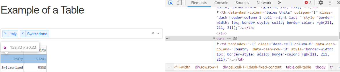
In order to customize the background colour when hovering on rows, I’ve added the following on the custom CSS file:
Image by author
5. Callbacks & Components
Once the dashboard layout has been defined and the chart and filter components have been placed on the page, let’s move to the callbacks.
I’ll go through some examples of Callbacks, focusing on the most troublesome that I’ve used.
5.1 Multi dropdown filter : how to have a “Select All” option
Dashboards very often include one or more dropdown filters, allowing the user to select one or multiple values at the same time.
In very simple cases, there shouldn’t be any Callback “behind” the dropdown component: the user selects one or more dropdown options; the selected values are normally “inputs” for other callbacks that adjust what’s presented on charts.
However, in more complex cases, we may want to have a multi-dropdown selection, where the options of a second dropdown depend on the selections of the first dropdown. In the example that I’ve created, I have a country dropdown and a city dropdown: the city dropdown options, definitely depend on the country that has already been chosen.
To add some more complexity, I’ve noticed there is not an out-of-the-box feature, in Dash, to “Select All”. Especially in those cases where the dropdown options are long lists, it is highly recommended to add a way to “Select All”, otherwise we would need to enter one by one all the options every time we want to analyse all values. Additionally, I also wanted to configure the dashboard in a way that “no selection” (ie. leave the dropdown blank) means that all options are considered.
In order to achieve all the features described here, I’ve followed the steps listed right below.
5.1.1 Create options lists
First of all, I’ve created a list of options for each of the Dropdown components. The data that I randomly created has the “Country” information on one column, and the “City” information on another. I’ve simply created two unique lists, one for all possible cities and one for all possible countries and I’ve added a “(Select All)” entry, which I wanted to have at the top of the option list.
Next, I’ve included the Dropdown component on the page layout, simply specifying the “multi” property:
Image by author
5.1.2 Manage option lists dynamically
I’ve then defined a callback that takes as input the list of values (selections) from the first Dropdown and returns, as output, the list of options of the second Dropdown.
Given that the list of options depends on the values, I’ve generated a dictionary where each key is a possible value of the first dropdown, and each value is a list of all possible options of the second dropdown. The result looks like the following:
{Brasil : [Fortaleza, Rio De Janiero, Sao Paulo],
Italy : [Milan, Venice], … }
To finalize the Callback, some key considerations are:
- the “values” from the first Dropdown will be a python list
- this list may or may not contain the “All” option
- leaving the list of values empty, will mean that we’ll have [‘’] as input of our Callback
As a first step, I’ve created a variable (isselect_all), useful to determine if the user has left the first dropdown blank, or if the user chose “Select All”, or neither of these two possibilities.
In the first two cases, the callbacks simply returns a sorted list of all possible cities. Otherwise, the user is picking one or more countries individually, therefore I’m using the previously created dictionary (that I named repo_groups_l1_l2) to calculate a sorted list of all possible cities.
Image by author
5.2 Unveiling seasonality patterns with Heatmaps
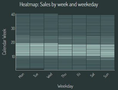
Among all possible charts, Heatmaps are ideal whenever we’d like to plot 3 dimensions and show seasonality or patterns in data. For instance, I’ve included a heatmap to show sales trend across the year (week number in my case) and day of the week, to see if there is any seasonality on these two dimensions.
The weekdays will be on the x-axis, the calendar week numbers will be on the y-axis; each cell will be colored depending on the sale volumes. The heatmap will also need to respond to filters (based on dates and on the city and country dropdowns).
5.2.1 Heatmap: the layout
First of all, let’s include a placeholder for the heatmap within the dash layout. In the below code, the headtmap will be in the last column with the id “sales-weekly-heatmap”:
Image by author
5.2.2 Heatmap: callback overview
Then, let’s move to the callback, which will have:
- inputs: the different filters — In my case these are the start and end date from the date picker and the “country” and “city” dropdown selections
- output: the above dcc.Graph “figure” element
- 1st section: data preparation. The callback will use the datasource (which consists of a single dataframe) and will filter and aggregate data by week nr. and weekday
- 2nd section: graph preparation (using Plotly: go.Heatmap). The chart will use a predefined colorscale which I custom created via a function
5.2.3 Heatmap: data preparation
In the data preparation part, I had to include some statements to handle the “Select All” for both the dropdown selections. In case the user has chosen this option from the dropdown, the dataframe doesn’t need to be filtered by country/city; otherwise, only the values selected by user will be considered from the initial complete dataframe:
mage by author
I’ve then filtered the dataframe by stard and end date and finally aggregated it by week number and weekday:
Image by author
5.2.4 Heatmap: graph configuration
In order to draw some nice and consistent charts, across the dashboard, I’ve created a go.Layout() variable (named corporate_layout) at the top of the callback file. This layout variable includes a lot of properties that are almost all the same across all dashboard charts (chart transparent background, font family, title font size, gridlines, zerolines, overall height, legend syle, margins, …).
Inside each chart callbacks, a new fig = go.Figure(data=data, layout=corporate_layout) is defined. This allows then to update the fig layout (via this command: fig.update_layout()) to adapt the corporate_layout and include the chart title and the axis titles.
With this approach, the main layout of the chart is defined only once: this helps keeping the code clean, but also flexible; i.e. in order to change all charts height, we simply need to adjust one variable in the whole code.
Regarding the “data” component of the go.Figure, I’ve used a go.Heatmap(), including a colorscale, which I’ll describe right below.
Image by author
5.2.5 Heatmap: add a custom colorscale
Plotly heatmap includes some standard colorscales we can choose from, or we can assign a custom created one.
Plotly provides some instructions (available here) to create a custom colorscale. The colorscale that I’ve used look like this : a list of 11 colors that are used by the heatmap according to the percentile of each datapoint.
Image by author
In order to generate colors in some gradient sequence, I’ve created a function that takes as input the amount of colors we need to generate and the RGB values of two colors: one will be the “starting point” and the other will be the “target point”. The function, for each color, increments the RGB values of the same amount, reaching the target one. It is a very simplistic approach, but this function serves the purpose:
Image by author
We can finally add the colorscale to the Heatmap to unveil some seasonality : as we can see, sales seem to decrease between week 10 and 20; then they started to increase reaching again the same levels by week 25+. We don’t have a significant seasonality within the days of the week.
5.3 Providing additional information when hovering on data points
Within Dash, hovertemplates can be defined to specify what data is shown in what format, when the user hovers the mouse on the datapoints.
It may be useful to include additional information in the hovertemplate, besides the data which is already used by the chart (x and y value, for instance). Plotly official documentation provides useful alternatives: I am going to present the one that I found most effective.
In the chart below, I’ve created a stacked bar-chart, where every country is represented by each vertical bar, showing the sales as the sum of each city individual sales. When hovering, I also wanted to show the information about the total target as opposed to the sales:
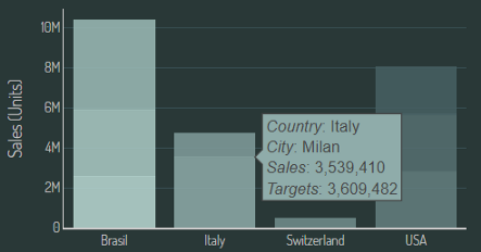
The “target” by city is an information present in the datasource, but it is something which is not shown in the chart: where is the hover-template taking this info?
The approach I followed is to basically create, within the dataframe used by the chart, a new column containing all info I wanted to present in the hovertemplate:
Image by author
Plotly hovertemplate requires some html formatting: “<i> </i>” for instance means that the content will be italic; “<extra> </extra>” is used to remove the trace name of the datapoint. Values are formatted with the d3-format’s syntax (as explained by Plotly here): “{:,d}” is used to include thousand’s separators (in case you’re wondering how that would work for other value types: percentages with 2 decimals can be formatted like this: “{:.2%}”; dates can be formatted like: “{x|%a, %d-%b-%Y}”.
Once we have the hovertext within the data, we can use it in the chart, just by assigning the dataframe column to the chart hovertemplate.
6. How to deploy and share the dashboard
Dashboards created via Dash can be deployed as Flask application. Heroku is definitely one of the most effective ways to make the application available online (and for free).
The guide I used to get this app deployed is very well explained through this video, including a list of approx. 15 steps to get this app online.
7. Conclusions
Plotly Dash is definitely a fun and very powerful Python library: I have been looking for a quick way to get repeatable analysis automated and very well presented and this definitely served the purpose!
With Python knowledge, some html & css experience, I was able to realize this dashboard during spare time in few weeks: I must say that embodying CSS Bootstrap to the layout made the difference and definitely allowed to build an underlying “grid” that allows to control very easily every section of the dashboard in the way I wanted to be.