Data visualization is the process of understanding data better and gaining insights from it by placing it in a visual context. Data visualization has become one of the most sought after skills. If you understand your data well, you will know what you have to do with it, to build a cutting edge machine learning model. Because Data visualization presents analytics visually, it enables you to identify correlations, patterns, and trends that would be undetected without it. Data Science and Visualization are certain to change the corporate landscape over the next few years. Since Matplotlib is one of the most used python libraries for data visualization, we will explore in this post how you can use it to get the most out of your data.
Table of contents:
- What is Data Visualization?
- Why do we need Data Visualization?
- How does it work?
- What is Matplotlib?
- How to use it
What is Data Visualization?
Data visualization is the presentation of data in a pictorial or graphical format. It describes an effort to help people understand their data better by placing it in a visual context. Patterns, trends, and correlations that would go undetected without it, can be recognized easier with data visualization. Data visualization presents analytics visually and enables you to grasp difficult concepts or identify new patterns. There is also interactive visualization, that enables you to drill down into charts and graphs for more detail, by interactively changing what you see.
Why do we need Data Visualization?
The human brain can process information a lot better when it is in a graphical form. A graphical representation of your data gives you a very good understanding of your dataset in general and what features are useful for your machine learning model and which ones not. One of the primary goals of data visualization is to communicate information clearly and efficiently with statistical graphics, plots and information graphics. For example, if you are working at a company and have to present your Data Analysis to your boss, he won’t understand why you made certain assumptions if you don’t show it to him in an easily understandable graphical form. So in order to understand your data in an efficient and quick way, you need Data Visualization.
How does it work?
First, you visualize a dataset to understand what the data actually is telling you. The next step is to make some more detailed analysis. Then you document your assumptions from the two previous steps. Thirdly, you may want to transform your dataset because your assumptions about the data make some features unnecessary, so you want to remove them. Then you visualize your data again and repeat the whole process until you are satisfied.
What is Matplotlib?
Matplotlib is one of the most used python libraries to visualize and explore data. It enables you to draw different types of graphs, like line, scattered, bar, and so on. You could say that it is the de-facto standard library for plotting data with python. Matplotlib can be used in Python scripts, Python and IPython shell’s, Jupiter notebook’s, web application servers, and four graphical user interface toolkits. It enables you to generate a visual representation of data with just a few lines of code.
How to use it
There are various types of plots available within Matplotlib. Today we will go through the following:

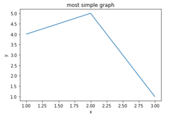
How to plot a simple graph


Now we will plot the same graph again but now we will label our axes and add a title to our graph.

How to style your graph
This time we will plot 2 lines on a graph and style them.


1. Bar Graph
A Bar Graph is used to compare things between different groups. They work very good if you try to measure the change of these relationships over time when these changes are relatively large.


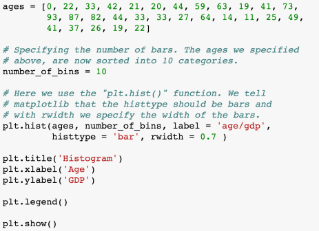
2. Histogram
Histograms have quantitative variables and bar graphs have categorical variables.
For example, if you want to plot the population for different countries, you should use a bar graph because it is categorical and the countries names would, therefore, be the categories.
An example where you should plot histograms would be if you have a dataset of people with varying ages and you want to visualize how much an age group is contributing to the GDP of a country.

3. Scatterplot
We use scatterplots to find out how much 2 variables (for 2 dimensions) or 3 variables (for 3 dimensions) are related to each other (e.g the correlation).


4. Stack Plot
Stack plots are used to identify changes over time for several groups or categories. They are very similar to the line graphs we discussed earlier in this post. You could, for example, display the stock market value over the last years and could easily spot the points where the market value started to decline or to rise.


5. Pie Chart
Pie Charts are very good for example to display things like market share of companies.


How to deal with multiple plots
The following code samples will explain to you how can plot multiple plots in different ways. First of all, we need numpy to do this, since we have to use numpy arrays.


