Ready to learn Data Science? Browse courses like Data Science Training and Certification developed by industry thought leaders and Experfy in Harvard Innovation Lab.

Photo credit: Pexels
“People hear statistics, but they feel stories.” Forbes, March 2016
“Telling a compelling story with your data helps you get your point across effectively.” InformationWeek, May 2016
Our brains love good stories and your bosses’ are no exception. J.K. Rowling once wrote, “The stories we love best do live in us forever”. The same applies to data. But what is data story telling? According to LeAnna Kent, the data scientist at Elder Research, “Data story telling marries data visualization with a guided narrative. It pairs data and the graph with words. It is not only describing what can be seen in the graph, but also telling a story to lead the audience through the analysis process.”
As data scientists, we need to be able to influence, We have analyses and insights that can identify opportunities and direct management’ actions but if we can not motivate business buy-in, our powerful Machine Learning algorithms will eventually collect dust on a shelf.
Data visualization is at the heart of data analytics, it is the representation of data in a pictorial or graphical format, it gives business users the ability to use information intuitively, without deep technical expertise.
Narrative is the key, it helps to explain to your audience what’s happening in the data and why a particular insight is important. Narrative reduces ambiguity, and connects data with context.
Therefore, in this post, we will explore data stories combine visualizations with a narrative flow, and hopefully, we will be able to convince our bosses to act on our insights. Let’s get started!
1. Visualization: Products purchased together
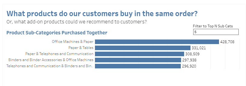
Source: Tableau public
Narrative: Our customers frequently bought the above products together. We are having a clearance sales for office machines this weekend. Let’s re-arrange our promotional layout, display Paper, Binders products together with Office Machines.
2. Visualization: Sales and profit
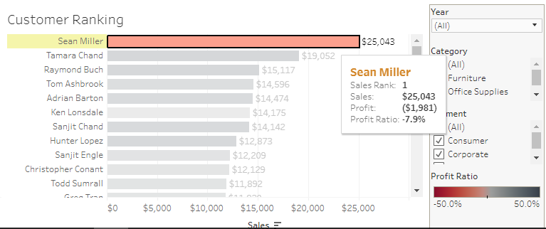
Source: Tableau public
Narrative: We should stop giving big discount to this customer. Let’s find a solution to offer discount and still make money.
3. Visualization: Sales forecast

Source: Tableau public
Narrative: According to our past and current sales and seasonal pattern, we can forecast sales for 2016 like so. The model has determined that there is a 95% likelihood that the value of sales will be within the shaded area for 2016. As you can see, February is typically is a slow month for consumer and corporate products. Shall we plan a promotion for that month?
4. Visualization: Profit and profit ratio
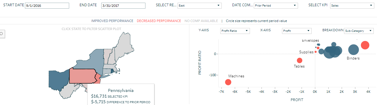
Source: Tableau public
Narrative: The profit ratio in Pennsylvania was down driven by a -134% profit ratio in Machines. This needs to be addressed immediately.
5. Visualization: Employee turnover
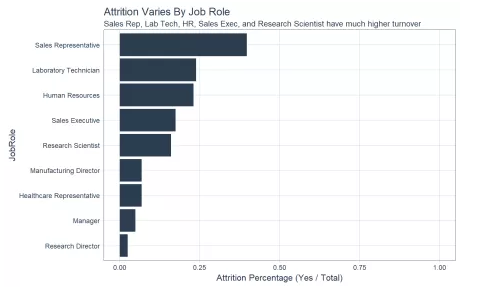
Source: R-bloggers
Narrative: Sales representatives have the highest turnover at about 40%, followed by laboratory technicians, human resources, sales executive, and research scientist. It may be worthwhile to investigate what localized issues could be creating the high turnover among these groups within the organization.
6. Visualization: Growth overtime
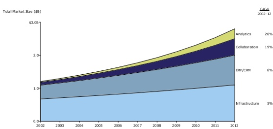
Source: Slideshare
Narrative: The collaboration and analytics solutions are growing more quickly than ERP/CRM and infrastructure. They might be a good target for next investment.
7. Visualization: Customer churn
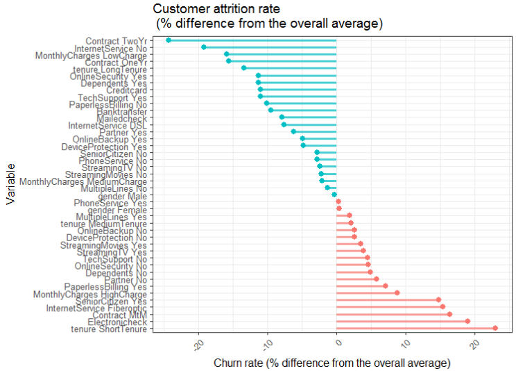
Source: DataScience+
Narrative: Customers with higher than average churn rates include those with an electronic check, with month to month contracts, with higher monthly charges and paperless billing. On the other hand, customers with low monthly charges, longer period contract, with online security services, with dependents or with partners, those paying with credit card or bank transfer showed a much lower than average churn rates. Let’s start working on a churn prevention program.
8. Visualization: Unprofitable days
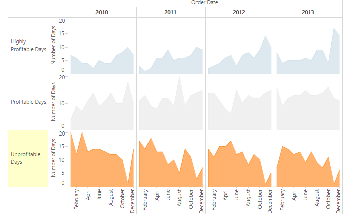
Source: Tableau public
Narrative: Our unprofitable days are more likely to occur in the early months of the year ( January to March). Let’s look for ways to up-sell each customer for these months to make us profitable.
9. Visualization: Sales goals
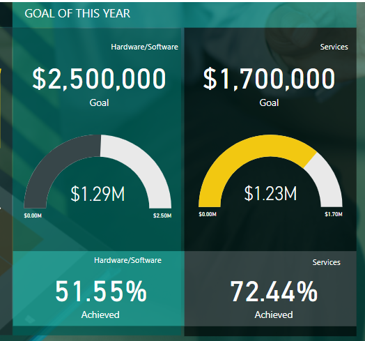
Source: Power BI
Narrative: It is November, we are unlikely to hit the annual sales target, especially in hardware/software components. Let’s figure out what went wrong.
10. Visualization: Executive summary
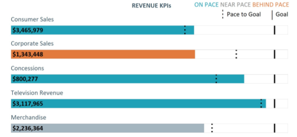

Source: Big Book of Dashboards
Narrative: Consumer sales is 5% ahead of the pace; this is likely driven by our newly opened store in Toronto. Corporate sales is well-behind the pace as expected due to the resignation of two sales reps. Merchandise is 5% behind the pace; consider replacing two sales reps as soon as possible and re-allocating the advertising budget to Merchandise so we can hit the revenue goals by the end of the year.
Summary
As you have seen, data story telling is hard work, because most of time we are not working with “compelling” data. We are either working with product sales data or consumer (or employee) behavior data. We have to be very creative to make our data into stories that are beautiful and persuasive. The best way to get your message across all the clutter is to merge these two powerful ways of communication — data visualization and narrative.
As E. Blundell said in his book “The Art and Craft of Feature Writing,”
“We’re supposed to be tellers of tales as well as purveyors of facts. When we don’t live up to that responsibility, we don’t get read.”
Remember, data does not inspire people, stories do. We need to wrap our vision in a story that inspires emotion and motivates action.
Finally, if you do not want to be questioned about your worth to the organization, tell them stories.


Like!! I blog quite often and I genuinely thank you for your information. The article has truly peaked my interest.
Thank you. For more updates, please subscribe to our blog
Thank you. For more updates, please subscribe to our blog